OpenOcean CREW
# From a UI refresh to an action-first mobile experience.
At a glance
From unused app
to action-first tool.
Wallet and Evaluations launched on Material 3. Reported outcomes included higher adoption within three months, fewer payroll queries, and positive offline acknowledgement feedback.
The challenge
Relaunch an unused seafarer app for Wallet and Evaluations. The brief allowed a UI refresh, while critical compliance information remained four clicks deep.
My contribution
Lead Product Designer / player-coach. Partnered with the tech lead and designers before taking sole design ownership of both mobile apps.

Maritime Tech
The approach
Audit the legacy experience, flatten navigation, adopt Material 3, and align payroll and banking workflows across teams.
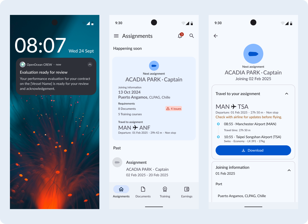
The challenge: more than a visual refresh
At 90POE, the shore-based app (OOS Mobile) was already helping operators manage urgent work away from their desks. OpenOcean CREW, designed for seafarers, had been built but never adopted by a customer. A client request brought it back into focus.
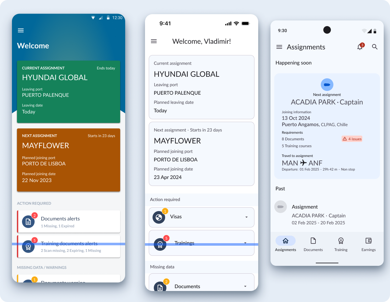
The legacy interface was disconnected from the Coral design system. More importantly, passports, visas, and other time-critical documents were buried in a generic list, four clicks deep. The challenge was to make operational risk visible—not simply make the screens look newer.
Why a reskin wasn’t enough
The initial direction was to apply Material Design components while preserving the existing navigation. The first reskin improved consistency, but still stacked document warnings, flight details, and welcome messages into a long dashboard.
Users still had to interpret the lists and find the problems themselves. I focused the redesign on a different question: what does a seafarer need to know or do next?
Put the work in the navigation
I replaced the generic dashboard with four direct destinations: Assignments, Documents, Training, and Earnings.
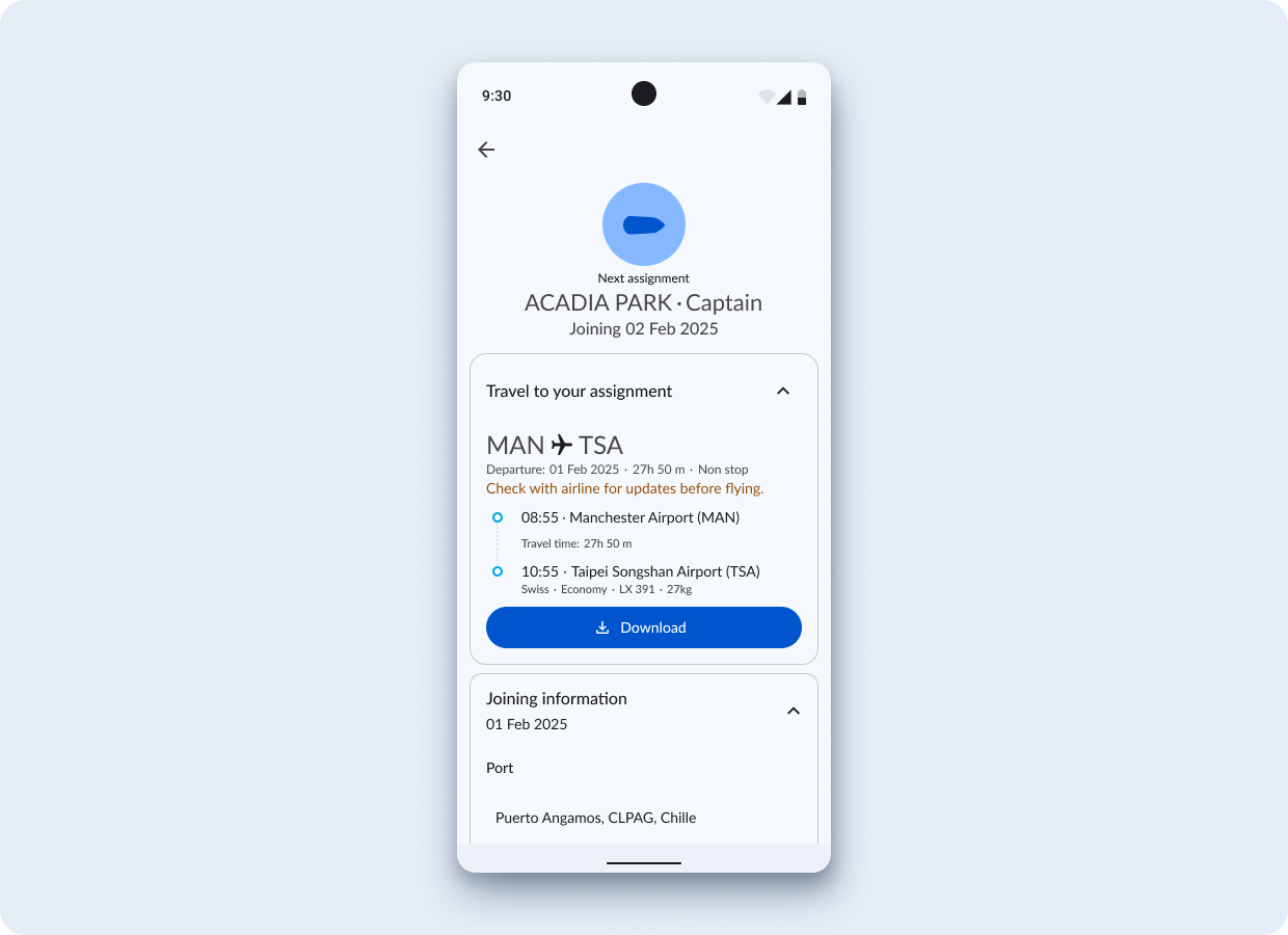
This flatter structure also made navigation a status signal. Badges on Documents and Training surfaced outstanding issues before users opened a list. Assignment details then brought joining information and travel into one contextual flow.
Summarise risk. Reveal the detail.
Using object-oriented UX principles, I replaced long lists of missing documents on the assignment card with a concise “4 issues” status chip. The summary made outstanding actions visible; the detail remained available when needed.
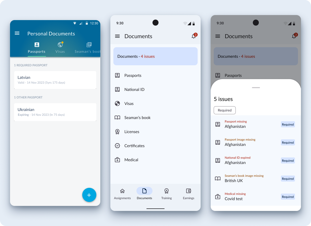
In Documents, a contextual issues sheet helped seafarers identify missing or expired records and move towards resolving them without losing the context of their task.
Design for real journeys
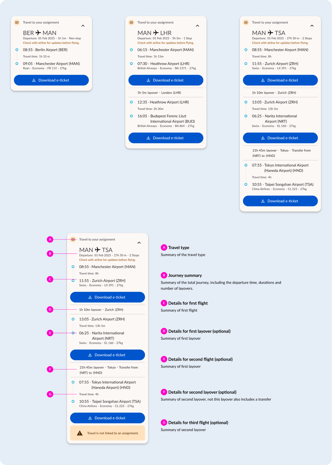
Reusable travel cards support direct flights, connections, and multi-leg itineraries. The annotated specification makes each part of the journey explicit for implementation.
Translate payroll into a clear mobile wallet
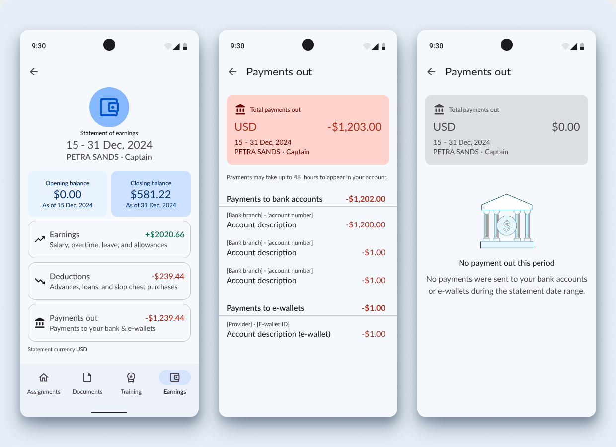
Alongside the redesign, I designed Seafarer Wallet so the office could provide crew with per diems and travel advances. The source data lived in OpenOcean STUDIO—a dense payroll system built for office specialists.
I translated that data into a readable statement of earnings, deductions, and payments. Labels, signed amounts, and semantic colour worked together to make each transaction understandable without relying on colour alone.
Close the feedback loop
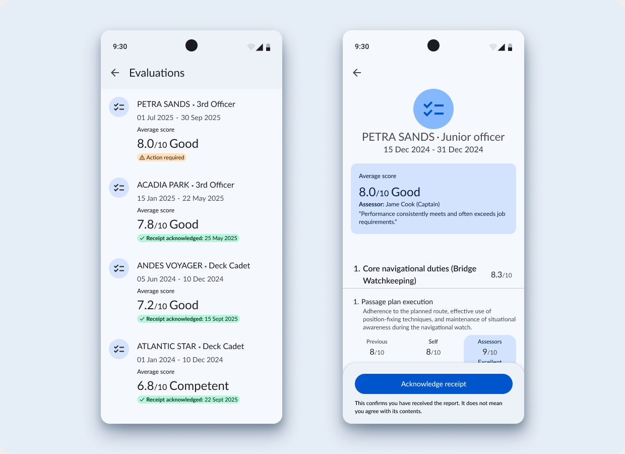
Performance reviews needed a clearer, more transparent record than informal conversations or paper forms. I designed a mobile flow for seafarers to review evaluation details and acknowledge receipt, including when offline.
The distinction mattered: acknowledging receipt confirms that the report has been received. It does not mean the seafarer agrees with its contents.
Align the service behind the screen
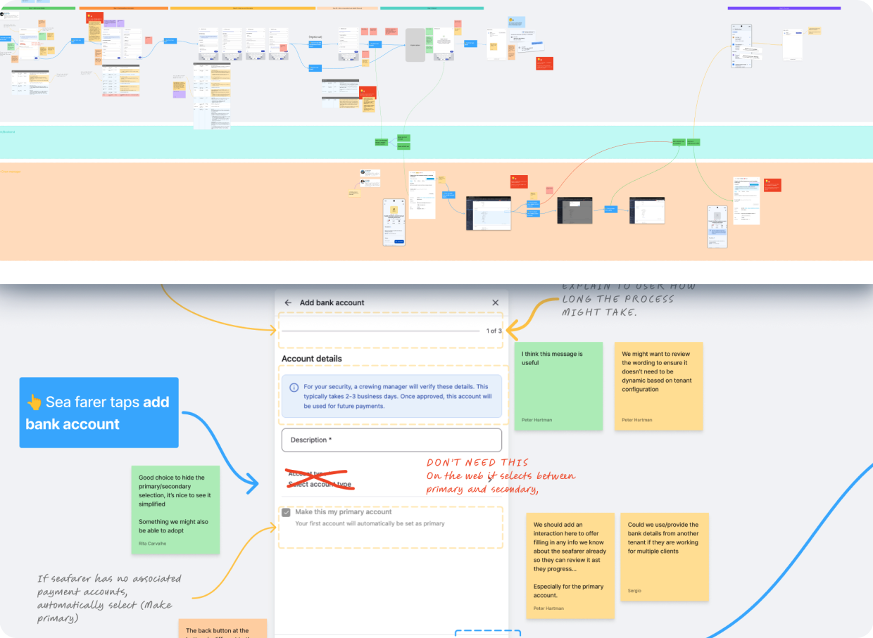
Adding a bank account involved more than a mobile form: multi-currency rules, correspondent banks, anti-money laundering checks, and manual verification all shaped the experience.
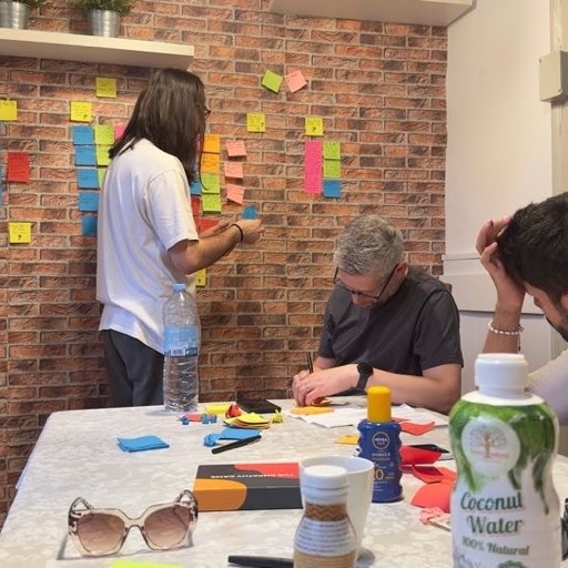
I led a cross-functional critique with mobile engineers, the Arctic backend team, and crewing product owners. Together, we mapped the mobile inputs, backend validation, and crew manager verification steps into a shared service blueprint—making dependencies and exceptions explicit before delivery.
Outcomes and what changed
The work moved the mobile ecosystem beyond a cosmetic refresh: a scalable Material 3 foundation supported the launch of Seafarer Wallet and Performance Evaluations.
Reported outcomes included increased mobile uptake within three months, a shift away from the legacy web portal, and fewer payroll-related support queries. The evaluations pilot also received positive feedback on offline acknowledgement.
The central design lesson: a consistent component library helps teams move faster, but meaningful improvement comes from restructuring information around what users need to do.